
Nice new t-shirts
I can’t count how many times over the years I’ve longed for Leeds United to be able to take the field at Elland Road once more, wearing shirts of pure, pristine white, unsullied by any tacky sponsor’s logo. Over those years, we’ve had many and varied brands besmirching the hallowed material, from RFW via Lion Cabinets, Top Man, Admiral and many more, through to the ill-fated Enterprise Insurance. I’ve regarded them all with more or less disgust and hostility – longing nostalgically for more innocent, pre-sponsorship days.
And now those days are back, if only temporarily. Barring a late twist, Leeds will be running out in colours free of any endorsement to start the forthcoming season. And do you know what? I’m not sure I like it. In fact I suspect I really don’t.
If that seems a little contrary, I can only hold my hands up and agree that it is. After all, this is what I’ve been wishing for these past 35 years. I was against shirt sponsorship right from the start, right from those early days of Hitachi and then Crown Paints on the red shirts of Liverpool FC. It just seemed too, too tacky for words, an offence against football aesthetics. To this day, I can’t handle Sharp (spit) electronics products without feeling the need of a bath – though this has more to do with the identity of the club sponsored, no doubt, than any deep-seated objection to Sharp – who once supplied me with a very nice radio-cassette player for my student bedroom.
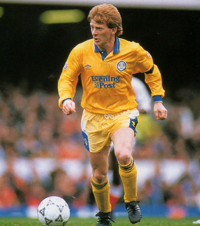
The only Leeds sponsor I came anywhere near liking was the iconic, title-winning Evening Post logo of 1991-92. That seemed properly Yorkshire, and – with Leeds dominantly resurgent – it neatly captured and still recalls the Zeitgeist of those heady days.
So I am, perhaps, being a little churlish to complain now. And I’m not in particularly good company either. The bulk of the Twitteratti seem to like the new shirt, there’s a general buzz of approval among all but the more portly chaps out there, who are viewing the snugness of the design with deep suspicion. The problem I have with the shirt, after all this time whinging about the tackiness of logos and how they detract from the all-important badge, is that without a sponsor’s brand plastered onto the chest, it looks curiously featureless. It looks, I’m afraid, like a t-shirt.
It would seem that, for me, the commercial age has swallowed up the sport of football, and made of it a dependent creature, bereft of much of its colour and detail in the absence of those once alien logos. A sports shirt now somehow doesn’t look right without its accompanying branding. It looks a bit forlorn, rather naked – as if somebody’s sent it out too hastily, having forgotten to apply the finishing touches.
Perhaps I’ll get used to it, if Leeds do indeed play the season out unendorsed. Almost certainly I’ll have more depressing things to worry and write about as hostilities get under way. And at least Leeds will be, as is their wont, the exception rather than the rule, swimming against the tide as such a maverick and popularly unpopular club ought.
But, in the long term, I find it hard to embrace the concept of these featureless, bland tops. Perhaps the best I can hope for is that the contractual spat with Enterprise Insurance can be resolved, leaving United free once again to sell their very soul to the highest bidder. We will then just need a sufficiently cool brand name and ideally a vast amount of money.
Red Bull, anyone?






At last, At last!!!! I can say it!!!
You are wrong!!!
(and that gives me great pleasure as you are always right – with sickening regularity!!! – but please don’t take offence and keep up the good work!!!)
LikeLike
I’m not that reliable on subjective matters of taste 😉
LikeLike
I totally disagree with you. Its the best kit in years
LikeLike
Rob am loving kit best for years very retro, yes pure white is the choice I would have but I am taking this, to be frank it aint gonna make us play better , I just hope we do. Hope you and yours are well am looking forward to season and some more madness from all camps, I used to be a parrot but I am alright now , I used to be a Parrot but I am alright now, I used to be a parrot but I am alright now !!!!!!!!!!!!
LikeLike
Awk!!
LikeLike
Sorry rob disagree ,Like you say it looks like a tee shirt that’s a big plus , I went to the launch last night, and I don’t usually buy the new shirt, but I like this so much I treated myself to one. It’s a big yes from me.
LikeLike
I might get the away one if they do a 5XL 😎
LikeLike
Erm that’s a tent !!!!!!!!!
LikeLike
I take pagoda size these days…
LikeLike
I totally agree with you Rob, was thinking the exact same thing. I too have longed for the sponsorless shirt only to feel as you do now it’s here.
I also commend you for showing the necessary restraint not to mention the God awful collar.
LikeLike
I’m not well qualified enough in matters sartorial!
LikeLike
I think you’re wrong, Rob …. I draw parallels with the shirts worn by (say) the Green Bay Packers or the Boston Red Sox – although the US are way ahead of us where commercial intrusion is concerned, their NFL and MLB teams continue to wear shirts unadorned by anything more than a small maker’s logo ….
LikeLike
Sounds good and unusually tasteful for Yanks 😇
LikeLike
spot on again rob. yes it’s what we wanted but then again it’s not what we wanted. plain white. no silly blue piping please. and I’ve never been a fan of that shield badge. and wasn’t that type of collar trendy about five years ago? think I’ll stick with my 1975 smiley white shirt although I really liked the Burton shirts of 1987. bet the away shirts pink and purple stripes mot
LikeLike
It’d better bloody not be, I’m pinning my hopes on yellow!
LikeLike
It is yellow – confirmed!
LikeLike
Yay 😀
LikeLike
Best kit indeed, if we just lose the blue collar and cuffs it will be a great kit, maybe next year eh!
MOT
LikeLike
More or less agree. I’d sooner take a small logo on the right chest or a well-chosen sponsor than those monstrosities on the shoulders or the dodgy trim. There shouldn’t be that much navy on a white Leeds kit!
LikeLike
think of it this way: I only ever wanted to buy one Leeds shirt. Why would I need anymore? Unfortunately I now have to walk round for the rest of my life looking like a walking billboard advertising Strongbow cider. Now, however, I could ditch that embarrassing piece of tat and get a shirt that really will last forever without becoming an embarrassment. It will advertise LUFC and no other grotty little company whose only interest lies in the profit they hope to make from a dubious association.
Plain and simple – just like me. This is wonderful news and I now declare that I’m fully joining the clamour of denouncement as evinced above. This is one time I feel really happy about disagreeing with you, Rob.If only it can remain that way for the rest of the season!
LikeLike
Works for me 😊👍
LikeLike
This may sound simplistic but I think a small Kappa logo on the right side of the chest would make a hell of a difference
LikeLike
This 👍
LikeLike
Great observation. Would have made a big difference. Plus lose the blue on the collar and cuffs.
LikeLike
I prefer it without a sponsors name plastered all over it. Like the shirt but agree that it looks a bit bare. Perhaps a small Kappa logo on the right hand side of the chest ?
LikeLike
Sorry Rob but I am another one to disagree with you.
I think this top looks classy it compares to golfers tops where there is only a small logo.
As I understand it , there is a more relaxed fit available, my husband is a 3XL so that will put a smile on his face.
I can’t wait for the season to start I’m feeling bad withdrawal symptoms now .
Glad you are back to blogging Rob keep up the good work, how’s the book coming along ?
LikeLike
Slow progress on the book, Jan. Life keeps taking over!
LikeLike
White is White and White is Right. Best kit since the glorious 60’s and 70’s
LikeLike
Guess yorksman beat me to it there !!! Great minds and all that….
LikeLike
I like the new kit pristine free from ugly sponsorship adverts, for a change I will buy this shirt, yes I’ve never bought a Leeds shirt for many decades although my children have bought me them for birthdays, xmas or even fathers day
LikeLike
It’s not that it’s blank with no sponsor. I like the retro 1978 shirt, for example. It’s just that it’s, well..tacky. It’s a cheap looking design that has none of the sheer quality and refinement of, for example, the Nike England shirt. Look at that one. It oozes style. Super sleek V neck. And it’s white. All white. This one looks great on kids. Because that’s what it is – a basic, no frills shirt you’d expect to see in Primark kids dept for about £4.99.
LikeLike
Call me mad im past the point of caring about what type of kit we play in would be happy if we played in skins if it meant we had 11 quality players on the field getting totally feed up with are Italian ken bates who wouldnt give the head of recruitment a job due to the urgency he was in to sign players then who do we sign next to nothing new owners same old nonsense when will the nightmare be over i will be shocked to my core if we dont sell one of are young gems In the nxt three weeks and pocket the change aka the ken bates business plan i think by this time nxt year massimo should have recouped any money he payed out buying us and all his talk of investment is just that talk
LikeLike
Have to wait and see, but I understand your slight cynicism.
LikeLike
Our traditional colours were blue and gold; those colours remained in our scarves after the change to white under Revie, and came back into our kit in the 70s (eg. the Admiral ones) in which Currie, Flynn, Graham etc excelled. What’s happened to the gold element? since when have we played in white and blue?
LikeLike
Yeah stop moaning about white top ! Great for wearing to go out in to pub wid out getting piss taken out of me, its very German looking lol
LikeLike
Why not have ‘Dan the ADHD man’ splashed all over the front?
LikeLike
It’s an idea, I suppose…
LikeLike
The shirt is OK and I understand the reason why it has appealed to many who don’t particularly want to wear a shirt with Jimmy’s Tyres on it but, rather than a nostalgic return to past glory, the whole thing smacks of a Billy No Mates. The strange, nay sad, reality in this commercial world of today is that a club such as ours, with its incredible fan base but with the owner from hell is not attractive to any sponsor. Who wants their commercial reputation tarnished by the next rant of a loon? Need I remind you 🙂 Wibble!!!
LikeLike
Pingback: The Health Problem Behind Those Tight-Fitting Leeds United Replica Shirts – by Rob Atkinson | Life, Leeds United, the Universe & Everything