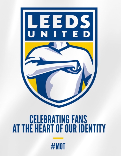
No, no, no. For the sake of our pride and sanity, please God – NOOOOOOOOOO!!!
A thousand times no. Bring back the Smiley, give us a football in a Yorkshire rose. But not this. This is the worst idea ever.
No.

No, no, no. For the sake of our pride and sanity, please God – NOOOOOOOOOO!!!
A thousand times no. Bring back the Smiley, give us a football in a Yorkshire rose. But not this. This is the worst idea ever.
No.


Don Revie, the Greatest Manager Ever

Billy Bremner, the Greatest Skipper Ever
Gordon Strachan, Second Only to King Billy

Howard Wilkinson, Second in Line to The Don


Well if it is going to be a Yorkshire Rose lets have a proper WEST Yorkshire Rose and not a North or South one!!!!,
LikeLike
so do you like it or not Rob?
LikeLike
Jury’s out.
LikeLike
You mean, jury went out and topped itself. Christ alive I can live with the top half but that image has to go.
I don’t like the lack of history and sense of place (it feels ‘ersatz’ and could apply to any team anywhere) and the overly aggressive message it sends, sure it often feels like / actually is Leeds vs the rest of the world but let’s not be so obviously obsessed about that, it suggests a lack of self-confidence that we need to advertise the Leeds salute like this. We are not a brand new MLS team.
LikeLike
I tend to agree with you on this, Rob. I’ve often wondered why we find it necessary to keep changing our badge, to be honest, why couldn’t we have just stuck with the original coat of arms style we started with? That said, of all the replacements we’ve had, it’d be a toss up between our current badge and the smiley for me.
LikeLike
I’ve long told my Stokie mates their club has the worst badge in football (red and white stripes with the words Stoke City, looks as if it was designed by a six-year-old). Now we have outstripped them. Aaaagghhhhhhhhhhhhhhh!
LikeLike
Awful, looks like something from a Marvel comic !
LikeLike
It’s as if the club feel there’s not enough people taking the piss out of us after Newport etc 🙄
LikeLike
Just checked my diary to see whether it was 1st April. One hundred year anniversary stuck in the second division and apparently with a badge my 4 year old Granddaughter would be ashamed of.
* Who are the 10,000?
* Is it a distraction from the unwillingness to acquire a much needed striker who might help us get promotion?
* Is it a ploy to get people to buy yet another new £50 shirt?
LikeLike
its an abomination, no one will tattoo this on their leg or chest thats for sure, do we know if the writing under the ‘crest’ is part of the badge? cant have an hashtag as part of our club logo, can we?
LikeLike
Is this April fool in January Rob? Or for real? If real the answer is
Don’t Buy!
…it won’t last long then!
Gerry Cwmbran
Mot
LikeLike
“Celebrating fans at the heart of our identity” but not consulting ANY of the fans at the heart of our identity?? Such a decision ought to have involved the fans and would, I am sure, have resulted in a much better option and UNIFIED the fans because they would feel included in the club’s identity. Instead, I feel saddened and that we have been cut adrift of “the club’s” vision and identity of OUR football club.
Clearly, AR’s honeymoon period is over with the “feel good factor” crashing to the floor just as the team start sinking in the league.
I cannot see any sudden rise in merchandise sales and hopefully AR will see the light and shelve this mistake asap.
LikeLike
New badge RUBBISH won’t be buying any thing with that on 👎
LikeLike
I understand the concept of making the club brand name more visible, with eyes on a larger share of the international market.
But this design is far too literal, whilst I have no doubt a shed load of money and energy has been spent the end result looks like something cobbled together on an ‘Apprentice’ task.
I would prefer something with the motto ‘You’re Shit ……. Argh’ – rather than this!!!!
LikeLike
What exactly did they ask these 10000 people? And is it me or does anyone else keep getting reminded of somebody burping and surrering heartburn? Next shirt sponser gaviscon?
LikeLike
Appalling ….have signed the petition and will listen intently to Angus Kinnear on Radio Leeds this evening at 6pm !
LikeLike
Angus Kinnear says leeds fans will “learn to love” the new badge. He obviously doesnt understand the fans or theres a new new badge on the way. How about the arm holding a P45 for Mr. Kinnear?
LikeLike
What difference does a logo make. It’s what the team does on the field that matters.
LikeLike
Absolutely NO No No!!!!! It’s appalling, it’s football for god’s sake, and it’s a Yorkshire club, please no, it’s like a builders t shirt. Bring back Yorkshire rose Leeds colours, anything but this monstrosity, it’s what should be a proud badge.
LikeLike
Obviously fake news. Just as a matter of interest was anyone on here consulted on this shambolic effort or do you know anyone that was?
LikeLike
Why should we “Learn to love it”? Sack the ba^tard!
No Respect for Fans!
Let him “Learn to love the dole!”
GerryCwmbran
MOT
LikeLike
Put Donald Trump’s face on the top and the humiliation will be totally complete. We will “learn to love it”. Sounds like something the Nazis said. Kinnear you are pathetic
LikeLike
If we had to change the badge , and why would we, going back to the smiley would be a good option . But not this abomination , it looks like summat a school kid would scrawl on his satchel, bloody awful ,
LikeLike
Hi Rob,
The Leeds salute is something special but this makes a mockery of it and of all the clubs badges we have had before,sorry but i do not like it one bit.
Best regards,
H.
LikeLike
Was this badge designed in Newport? Sigh … 😖
LikeLike
It looks like an advert for tattoo removal. Don’t know what’s worse,the badge or the slogan. Awful.
LikeLike
Bad! Wrong! No! 1. The concept of the Leeds Salute is wrongheaded: this identifies Leeds fans to one another, not the world – ‘poor simile, but it’s like Freemasons advertising their funny handshake. 2. Leeds has a brand; it might needs improving but it doesn’t need reinventing. 3. Visually, the design is weak, muted and recessive – it doesn’t stand out.
On the positive side, I take the point that the current design doesn’t say ‘Leeds United’ – I’ve never liked the scratchy, italic caps LUFC. This could be changed without straying too far from the established brand. And I wouldn’t miss the Yorkshire Rose containing a football – look closely and it resembles a comic book space monster!
LikeLike
I think the 10,000 people were all from Manchester. Surely this is some sort of dare / joke or maybe the servers over at LS11 have been hacked by a Huddersfield Town fan and this is all a hoax.
If this badge makes it to the shirt then our next sponsor may as well be Gaviscon….who are probably consulting their legal team over image rights infringement.
LikeLike
Give it a red card and ban it for life……for bringing our football club into disrepute and kicking us in the ———— (put your chosen area of anatomy in the blanks, feel free to add more blanks).
LikeLike
Please No.Newport was embarrassing.This is beyond that,its a joke,surely.No.It looks like a card from a comic,No please.
LikeLike
Leave the badge as it is, seems to me Radzianni and Co have about as much idea of a new badge as they have of the quality of new players we need to gain promotion, outright untruth regarding 10,000 consultations , never mind a new cooperate brand get some new players in ASAP MOT.
LikeLike
Terrible,no connection with the club in my opinion.I think there is no soul in that crest,where is the Yorskshire rose,apart from ourselves the fans who would know this is a Leeds crest.
LikeLike
Thankfully, the club appear to be open to rethinking this, after a petition gained (allegedly) 50k signatures in one afternoon. Fan power – great stuff ⚽️👍
LikeLike
nearly 60,000 now Rob!
LikeLike
Amazing in just a few hours. The club have got the message, for sure. MOT
LikeLike
Rethinking! Where was the thought in the first place! The current shield granted is a bit generic and unimaginative but why the sudden desire to change it? I’m still with AR on his engagement with the fans but surely concentrating on first team reqruitment is a more pressing concern than dicking around with the badge. Smiley / rose with you there Rob otherwise let it be.
LikeLike
We have more urgent priorities, but this has usefully demonstrated the depth of fan feelings for and engagement with LUFC.
LikeLike
So they’re re-thinking it…thank god !
But the thing is, the damage has been done, once again our club has been made a mockery of, and I once again will have to endure copious amounts of piss take down the local come Friday night from town supporters.
LikeLike
They seriously need to name the marketing company or person within LUFC that drew up this design. Someone needs to fall on his ‘crayon’ for this one!
LikeLike
Or her ‘Crayon’
LikeLike
I think its excellent
Should keep it as it is
For where we are now i think it suits the club
LikeLike
At least Kinnear and the badge have something in common …….they’re both headless!
LikeLike
You are on your own mate!
LikeLike
Find me the 10k people that were consulted on this…did thy live in Manchester by any chance. Awful.
LikeLike