

Add a 1919 somewhere, and this crest has it all
Whether by accident or design, this week’s “New Club Crest” furore has almost chased transfer window considerations clear off the front and back pages of the Leeds United news sources, temporarily at least. That will change as the days and hours tick down, with our striking options still not reinforced – but, for the time being, “Crestgate”, as at least one national radio station calls it, remains a burning topic. It’s also one that, for once, unites much of the Leeds support. The response to the club’s proudly announced “Leeds salute” design was an almost unanimous one of horrified disapproval. On the positive side, the powers that be appear to have listened and, somewhat chastened, are urgently reconsidering.
One of the side effects of the club crest cock-up is that various sources on Twitter and other social media have favoured us all with their own designs for a new badge. It’s been a case of The Good, the Bad and the Ugly, as you might expect but, encouragingly, the good has been very good indeed, putting the United Graphic Design Department to shame. It’s all very subjective, of course – but, for me at least, any new badge (if we actually need one) should combine some iconic symbol from the past with a hint of local or regional identity, and it should be very distinctly Leeds with, if possible, a nod to our forthcoming centenary.
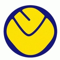
The badge pictured above (NOT my own design) does it for me – it’d be absolutely perfect with a bit of subscript, as you get with Cup Final crests, reading 100 years of Football 1919 – 2019. There’s the smiley badge prominently featured, an image from the past rightly hailed as “brilliant” by the ever-excellent Moscowhite of Square Ball fame. And there’s the Yorkshire Rose too, and the LUFC footballs from the 1990 promotion badge. And yet it’s not too cluttered, which is a pleasant relief from certain well-meaning suggestions that have seen the light of Twitter this week.
I’d certainly like to see something like this, should a change actually have to happen. Another option, obviously, would be to retain the current shield, which has become iconic in its own right – again, probably with that subscript acknowledging the Centenary. What do people think? I’d be grateful for any views or alternative suggestions – even from the 10,000 who are taking the rap for the Leeds salute effort – not that I know a single man Jack or girl Jill of them.
Here’s hoping that, on more considered reflection, the club gets it right next time.


It’s a good start. Could 1919-2019 be fit on the blue outer circle to signify the centenary and ‘Marching on Together’ which is effectively our motto possibly in a semi circle either. Over or under the badge?
LikeLike
It’s stark enough in itself to stand some embellishment, but not too much I hope.
LikeLike
Perhaps the symbol of our city, the Owl should be somewhere on the new badge as it has in the past.
LikeLike
Possibly. I’m personally a big fan of the smiley badge, which was revolutionary in its day and would still be cutting edge now.
LikeLike
I’d stick with what we have, with some script to acknowledge the centenary. I’ve often wondered why we change our badge so much anyway but the current badge is, as you rightly say, iconic. It is instantly recognisable and also unmistakably OUR badge.
MOT
LikeLike
Rob, I usually enjoy your humour but now I have a sudden heart-sink that you are being serious about this knock-up design. Please tell me you are being tongue-in-cheek and not tongue up the arse of Leeds’ history of bad design!
LikeLike
Noooo, I genuinely love it! What’s not to love??
LikeLike
Yes don’t have a problem with this design Rob, but in truth I still like the present shield …..instantly recognisable with maybe a slight adaptation if that’s what they’re determined to do, for the centenary !
LikeLike
Keep the new shield and Leeds united and put the white rose inside it. 1919-2019 at the bottom Job done. Mot . Gerry Cwmbran
LikeLike
Any Yorkshire rose should be West Yorkshire one, 2 adjacent petals at the
LikeLike
my preference would be a design which actually denotes our 100 year anniversary….
it would consist of a Shield crest divided into 4 quarters..
in each quarter it would have a design which was relevant to our history..
my preference would be
1. the Owl as per our early history (late 60s)
2. The Yorkshire Rose
3.The Peacock
4. The 70s LU logo (although ive never been a fan of this design) or the LUFC script
All this with a wavy banner (above or below) denoting 1919-2019 or 100 years of Marching on Together..
This could be a centenary Special then reverting to a favoured design ongoing but still denoting 100 years of Marching on Together as our Official Club Motto..
LikeLike
Great Rob, but like the current Leeds badge there is something fundamentally WRONG with this… The White Rose is upside down. Check out The Yorkshire Flag to see how it should be. Yours is a white Lancashire Rose. Get it the right way round FFS
LikeLike
I didn’t make it mate, and I’m no expert on roses – I just like the overall look. If they adopted this (and I’m sure they won’t) then it’d be down to the graphics guys to get the detail right.
LikeLike
Alternatively your favoured design Rob, but instead in the middle the Leeds Coat of Arms shield (with the 2 owls eitherside of the hanging sheep)
and the border filled with alternating football and LU logo again with a banner (above or below) depicting 100 years of ‘marching on together’..
One off centenary special for our anniversary kit season…
LikeLike
I would like to see “Side Before Self Every Time” somewhere such as a scroll beneath the badge?
LikeLike
What’s wrong with the Badge we have.According to the powers that be it represents poor football and failure.No,that’s the ownership,management and players over these barren years.Leave it.
LikeLike
Just add Marching On Together and take out the old fashioned AFC and it would do for me. I agree Rob we need that Smiley in somewhere as it looks as fresh today as it did in the seventies and is the embodiment of better days of the past and the future.
What on earth was Kinnear thinking getting this designed in Shoreditch east London – a West Ham connection maybe? The design has fascist overtones and being created in Mosley’s stronghold makes it even worse. If Kinnear has driven this he should consider his position in my opinion.
However, the whole world if it didn’t before knows Leeds United and how big a club it is raising 50k signatures in a few hours and the ‘Ridsdale’ present badge which I personally never liked doesn’t tell anyone it is Leeds.
LikeLike
Well I think the comments above reflect how difficult it is to arrive at a consensus over something like a badge, not that I am excusing the proposed new example which is horrible..
I quite like the one you have here Rob; it reflects Leeds and Yorkshire – I think it needs to have a stronger font and the centenary dates
LikeLike
No, no, no, Rob. that’s dreadful. I agree with the dismay directed towards the ‘Gaviscon’ design, but let’s not rush into a dog’s dinner of a mish-mash like this on the rebound. What are those gratuitous little footballs on either side of the circle? They look like something drawn in primary school. I even prefer our current one.
I would favour the city crest as worn in the John Charles era (complete with owls and the hanging sheep), or the ‘Smiley’ – either with yellow letters, or blue as it evolved in the 1970s. I agree that ‘Marching On Together’ might be an appropriate addition to whatever’s eventually chosen.
LikeLike
Have you forgotten the football in the Yorkshire Rose?
LikeLike
I’ve just seen a sample on FB and YEP that has a similarity to your one Rob but it’s better. https://www.yorkshireeveningpost.co.uk/news/leeds-united-owner-breaks-silence-over-new-club-crest-1-8982217 Maybe something between the two?
LikeLike
Yes agree with this 100%,as you say add 1919 and we would have a lovely crest.
LikeLike
Seeing as it is a Centenary Badge let’s have the Heraldic crest of Leeds again , MOT at the bottom instead of ‘Pro Reg Et Lege, MOT.
LikeLike
Yes but not sure about the dead sheep!
LikeLike
It’s perfect Rob. Please get the powers above to go with this , love It it’s brilliant, centenary dates to add, the rest perfect.
LikeLike
The badge design above is O.K., but the white rose petals do look a bit bare without the clubs name on them and why not put 1919 in the centre of the white rose instead ?
The white rose badge from the Gray, Bremner and Wilko days, should never have been ditched in 1998, but Ridsdale and co are to blame for that and did it undemocraticaly.
I’d really like to see the Leeds coat of arms in the middle of the badge, rather the white rose, because that represents the city of Leeds.
The Leeds coat of arms was on the Leeds shirts in the 1950’s and also on the Leeds Rugby League shirt, before they changed it to the Rhinos badge.
Why not just have a very small white rose above the Leeds coat of arms ?
LikeLike
There’s been some good alternative’s showcased for sure but i’m not keen on any design that has an owl, there’s already a club with an owl on its crest over in south Yorkshire.
LikeLike
NO, NO,NOOOOOOOOOOOO, please not another petition. It has not even got to the voting for stage yet. Also as Rob says it’s not his design but in his opinion almost right for him. Lets just all agree to differ in taste and get the best possible option.
LikeLiked by 1 person
Get the West Yorkshire Rose in its correct format, 2 petals at the bottom instead of one, who the fck wants a South Yorkshire Rose on a Leeds United badge??!!!, might has well put th fkn Dee Daa’s on it as well hahaha MOT
LikeLike
Yep. Not much to dislike about your recomendation Rob. Ticks all the right boxes. Some good suggestions on here regarding alternatives. I quite like the shield divided into quadrants idea(each section containing owl, sheep, rose and smiley) perhaps a bit busy. Billy’s ‘team before self’ in Latin as a motto featuring somewhere is tempting too. Still, bigger fish to fry on Tuesday night. 3 points there and you can have any badge you like. MOT. BTW we moved up a place yesterday without even playing! How good are we!
LikeLike
Some of our best weekends have been when we haven’t played 🙄
LikeLike